
Footer
On this page
Landmark roles
<rh-footer> and <rh-footer-universal> (when used outside of <rh-footer>) already include a contentinfo landmark role and therefore do not need to be wrapped in a native <footer> element. This contentinfo role is applied automatically through the ElementInternals API.
If a <rh-footer> or <rh-footer-universal> is placed inside an existing <footer> element, the custom element will not receive the contentinfo role. In those cases, implementors should remove the surrounding <footer> element and rely on the role applied directly to the custom element via ElementInternals.
Keyboard interactions
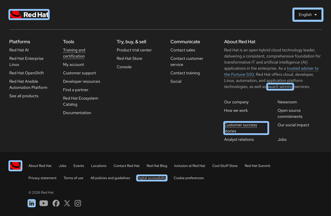
The footer includes many different interactive elements that can be navigated with a keyboard.
| Key | Result |
|---|---|
| Tab | Moves the focus to the next interactive element |
| Shift+Tab | Moves the focus to the previous interactive element |
| Space | Opens the language selector menu |
| Up arrow / Down arrow | Moves the focus to each language |
| Enter | Selects a language and enables it on the page |
| Esc | Closes the language selector menu |
Focus order
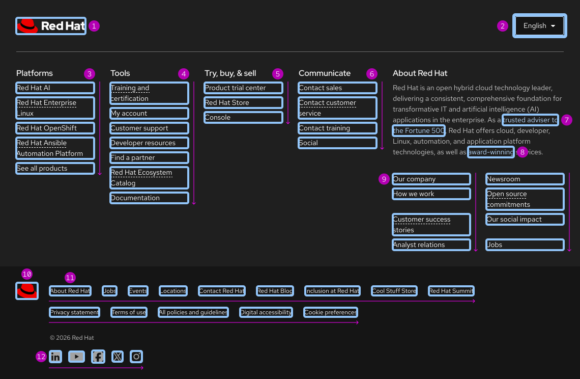
A logical focus order helps keyboard users operate our websites. Elements need to receive focus in an order that preserves meaning, therefore the focus order should make sense and not jump around randomly. The focus moves across regions of a footer from left to right and top to bottom.
ARIA Authoring Practices Guide (APG)
Learn to use the accessibility semantics defined by the Accessible Rich Internet Application (ARIA) specification to create accessible web experiences.
Web Content Accessibility Guidelines
Automated testing
Some of our elements may receive errors or warnings that are false positives from automated testing tools. If you are experiencing some of these issues, please read our update on false positives in automated tools.
Understanding documents provide detailed explanations for Web Content Accessibility Guidelines (WCAG) guidelines and success criteria.
-
SC 2.1.1 Keyboard (Level A)
-
SC 2.1.3 Keyboard (no exception) (Level AAA)
-
SC 2.4.3 Focus order (Level A)
-
SC 2.5.5 Target size (Level AAA)
Other libraries
To learn more about our other libraries, visit this page.
Feedback
To give feedback about anything on this page, contact us.
