Skip to main content Home About the Design SystemRoadmap OverviewDesignersDevelopers OverviewColorGridIconographyInteractionsSpacingTypography Overview Global colorBox shadowTypographyBorderOpacitySpaceLengthIconBreakpointsMedia queries All elements Accordion Alert Announcement Audio player Avatar Back to top Badge Blockquote Breadcrumb Button group Button Card Chip Code block Call to action Dialog Disclosure Footer Health index Icon Jump links Menu dropdown Navigation link Navigation (primary) Navigation (secondary) Navigation (vertical) Pagination PopoverPlanned Progress stepper Readtime Scheme dropdown Scheme toggle Select Site status Skeleton Skip link Spinner Statistic Subnavigation Surface Switch Table Tabs Tag Tile Timestamp Tooltip Video embed How to useProject FeltColor PalettesCustomizingDevelopers All PatternsAccordionAlertCall to ActionCardFilterFormLink with iconLogo wallSearch barSticky bannerSticky cardTabsTagTile AI design principlesLegal requirementsTransparency noticesIconographyColorChatbot avatarsAnimation All Personalization PatternsAnnouncement FundamentalsColorAccessibility toolsAssistive technologiesCI/CDContentContributorsDesignDevelopmentManual testingResourcesScreen readers Design/code status Release notes Get support

Footer Since v1.0.0

OverviewStyleGuidelinesCodeAccessibilityDemos
UsageLayoutDomainsResponsive designBest practicesUsageLayoutDomainsResponsive designBest practices

Usage

Use the footer to provide visitors with additional content and show them they are using an official Red Hat website. The footer should be the last element in a layout or user interface and is persistently displayed across all screens of an experience.

Layout

Domain-specific

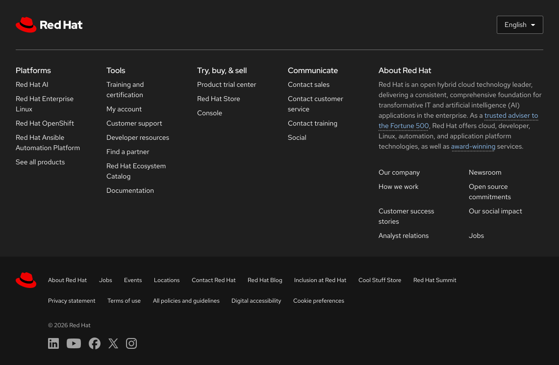
All slots in the Domain-specific footer can be customized with different content.
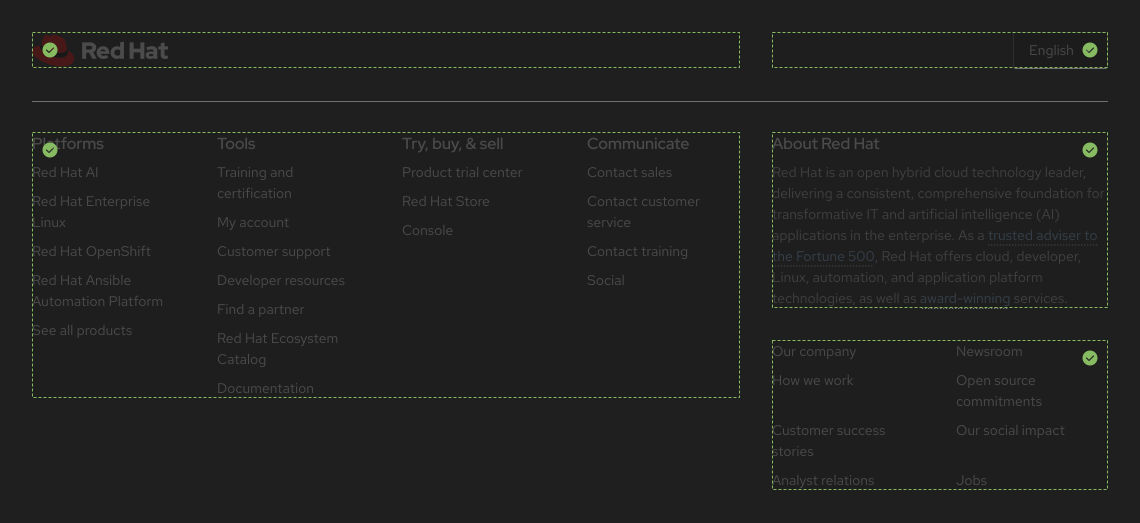
The website-specific footer showing regions that all regions can be customized

Universal

No slots in the Universal footer can be customized.

The universal footer showing no regions can be customized

Domains

The footer was designed with flexibility to be applied to all Red Hat web properties.
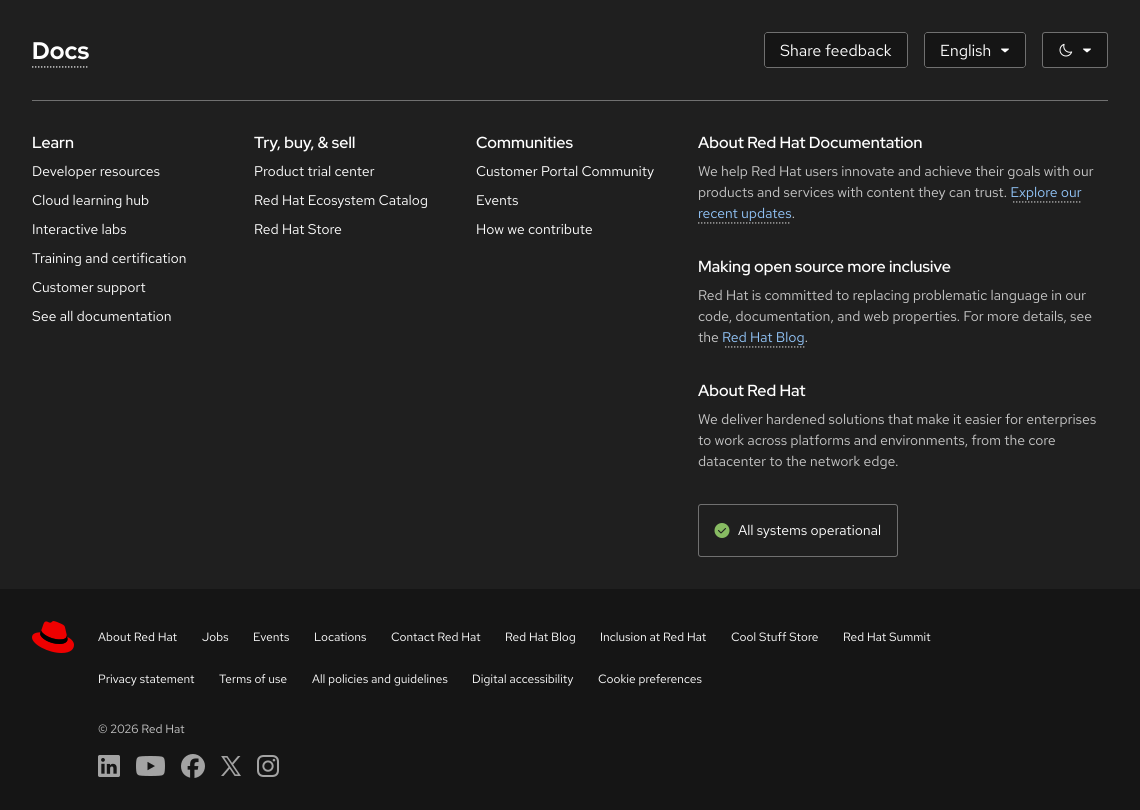
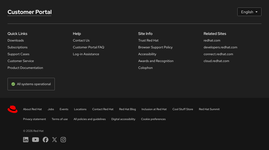
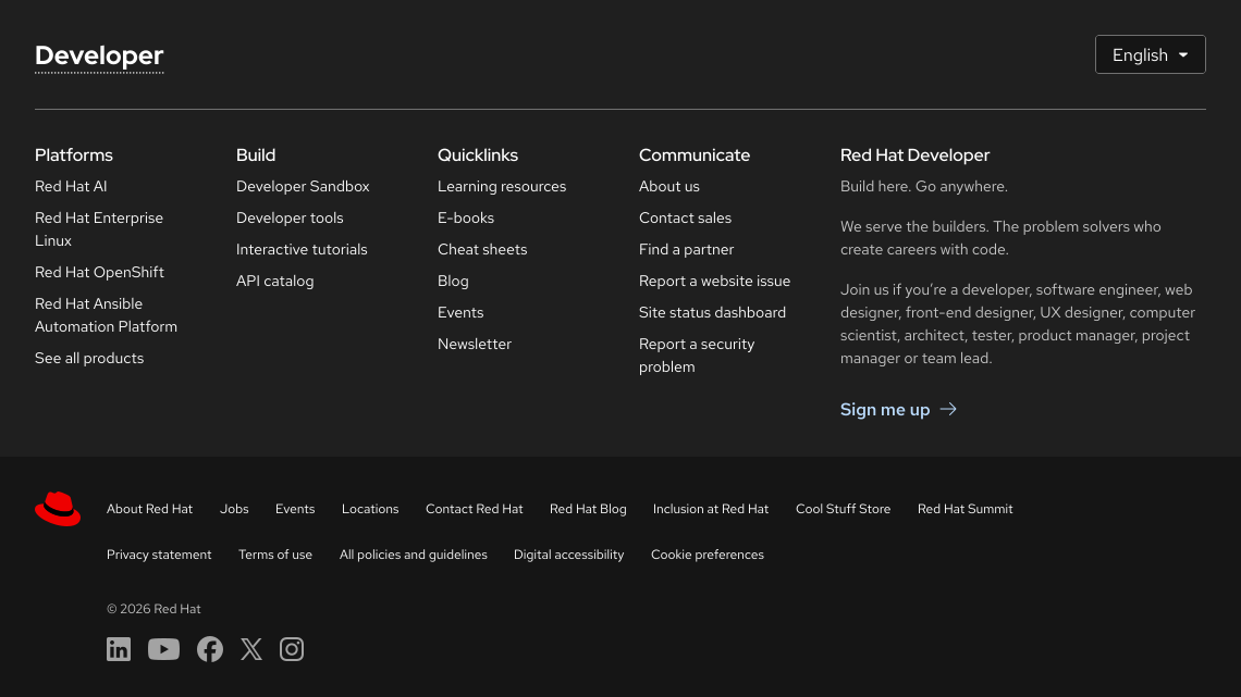
The Footer customized with docs.redhat.com content. The Footer customized with customer portal content. The Footer customized with developer.redhat.com content.

In some rare cases, the Universal footer may be used by itself.

The universal footer showing two lines of links and linked social media icons

Responsive design

Large viewports

A large viewport footer

Small viewports

Columns will collapse to an accordion as viewports get smaller.
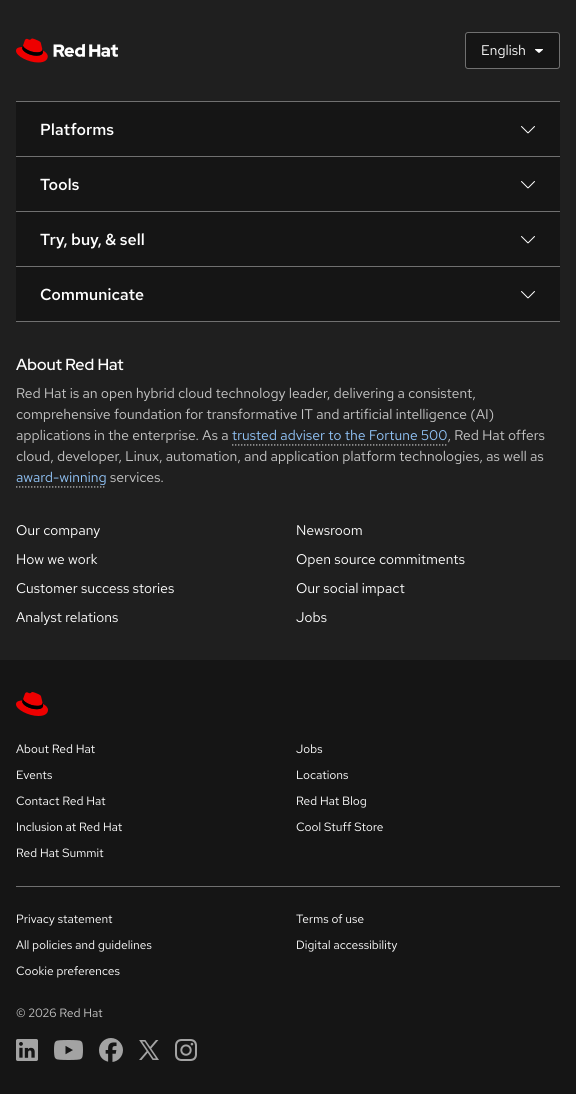
A small viewport footer

Best practices

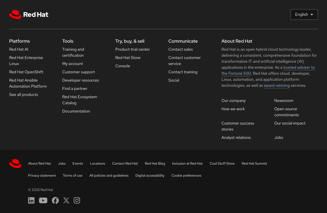
The footer shown with both the website specific footer and the universal footer below it.

If the Domain-specific footer is used, the Universal footer should always be present.
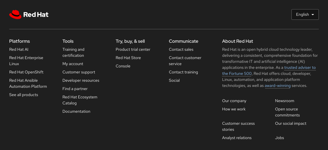
The footer shown with just the website specific footer and no universal footer below it.

Do not use the Domain-specific footer by itself without the Universal footer.

© 2026 Red Hat Deploys by Netlify