Skip to main content Home About the Design SystemRoadmap OverviewDesignersDevelopers OverviewColorGridIconographyInteractionsSpacingTypography Overview Global colorBox shadowTypographyBorderOpacitySpaceLengthIconBreakpointsMedia queries All elements Accordion Alert Announcement Audio player Avatar Back to top Badge Blockquote Breadcrumb Button group Button Card Chip Code block Call to action Dialog Disclosure Footer Health index Icon Jump links Menu dropdown Navigation link Navigation (primary) Navigation (secondary) Navigation (vertical) Pagination PopoverPlanned Progress stepper Readtime Scheme dropdown Scheme toggle Select Site status Skeleton Skip link Spinner Statistic Subnavigation Surface Switch Table Tabs Tag Tile Timestamp Tooltip Video embed How to useProject FeltColor PalettesCustomizingDevelopers All PatternsAccordionAlertCall to ActionCardFilterFormLink with iconLogo wallSearch barSticky bannerSticky cardTabsTagTile AI design principlesLegal requirementsTransparency noticesIconographyColorChatbot avatarsAnimation All Personalization PatternsAnnouncement FundamentalsColorAccessibility toolsAssistive technologiesCI/CDContentContributorsDesignDevelopmentManual testingResourcesScreen readers Design/code status Release notes Get support

Footer Since v1.0.0

OverviewStyleGuidelinesCodeAccessibilityDemos
StyleColor schemeSpaceInteraction statesStyleColor schemeSpaceInteraction states

Style

The footer is a stack of two containers that include a variety of content and elements. Elements in the footer are high in contrast so they grab the attention of users and meet accessibility guidelines. A footer is designed to look similar in style to the primary navigation to ensure a consistent user experience across websites.

Anatomy
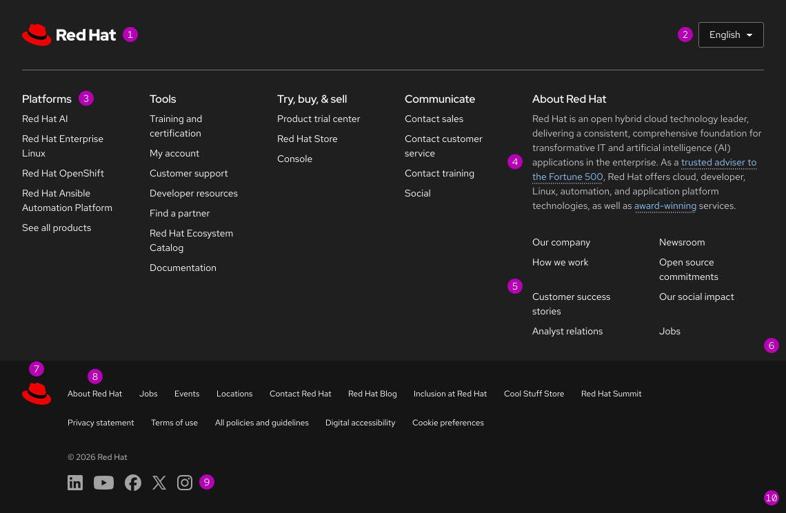
A footer showing lots of annotation numbers next to various styles and other elements. See annotations below.
  1. Domain logo
  2. Switcher
  3. Domain section title
  4. Domain text
  5. Domain links
  6. Domain-specific footer
  7. redhat.com link
  8. Global links
  9. Social media icons
  10. Universal footer

Color scheme

The footer renders in the dark color scheme.
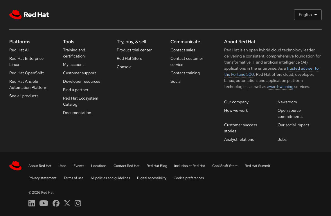
Dark scheme footer uses a very dark gray for the main footer and a black background for the universal footer with light text and links.

Space

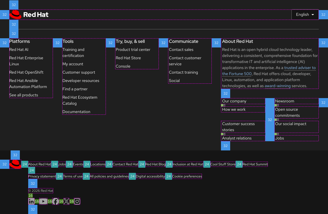
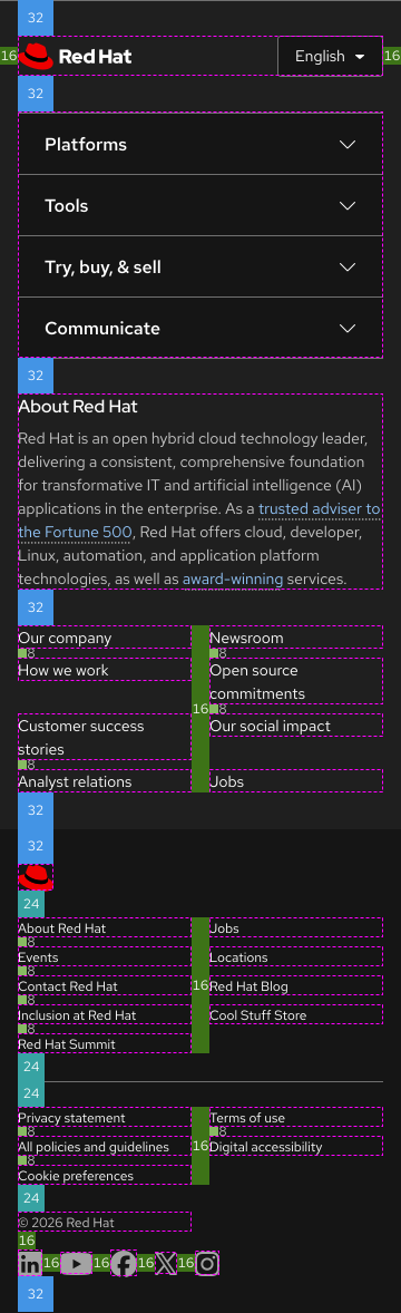
A desktop footer uses the 32px space token for gutters and page margins. The Universal Footer uses the 24px token between links and the 16px token between social media icon links. A tablet footer showing space values in between elements

Interaction states

To see live interaction states, go to the Demos page.

© 2026 Red Hat Deploys by Netlify